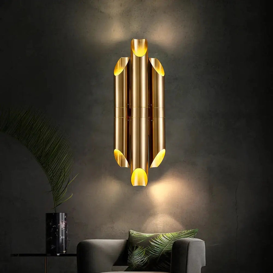
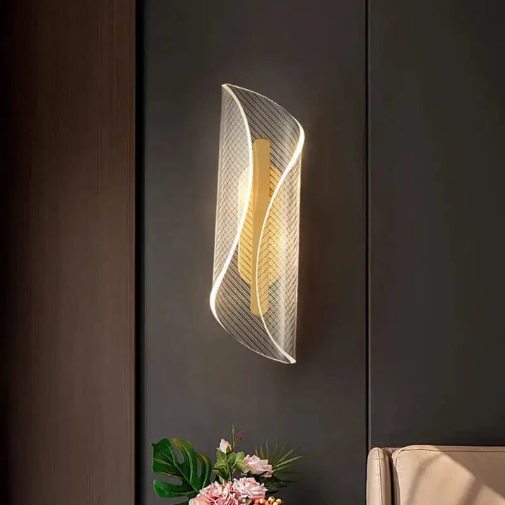
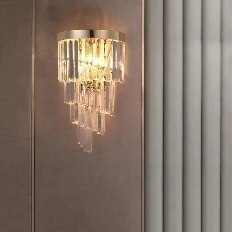
Explore gold wall sconces with sculptural shapes, curved shades and decorative details. Find a look for your bedside, hallway or living room, then compare the designs below.
Gold can be a small accent or the main feature on your wall. Start with the outline: a tubular design adds structure, a curved shade introduces softer lines, and hanging details create a more decorative focal point.
A defined, orderly look: compare grouped tubular shapes and a clear vertical outline.
Softer lines: compare curved shades and rounded details alongside your furniture.
A decorative accent: compare clear hanging pieces, smoky details and how much gold frame remains visible.
A tubular silhouette, shown in a gold tone.Curved patterned wall-light shade with gold-toned details.
Decide where one light—or a pair—will work
A pair can frame a bed or living-room mirror; a single sconce can draw attention to a corner or one side of a seating area. Use paper cut to the fixture’s height and width to compare its outline on the wall before choosing.
Bedside: compare the view from your pillow and your usual sitting position.
Hallway: compare depth as well as width so the fixture leaves comfortable space as you walk past.
Living room: try a matching pair beside a mirror for symmetry, or one decorative design near a chair for a less formal arrangement.
Bring the gold into the rest of the room
Repeat the gold tone in a nearby mirror, picture frame or handle to connect the sconce with the room. You do not need every metal finish to be identical: a gold frame with darker details can sit comfortably alongside black furniture or hardware.
Compare close-up images for the balance of gold, clear and smoky elements. Choose the combination that works with the whole room, rather than trying to match a finish name alone.
Gold x Clear Crystal configuration; other finishes share the product page.
Look for a clear outline and a shape that complements your furniture. Tubular forms can add structure; curved shades create a less angular silhouette. Choose the shape first, then compare how much of the gold finish is visible.
Should I choose brushed or shiny gold?
For a quieter accent, start with a brushed-looking surface; for a more noticeable highlight, compare shinier finishes. Look at close-up photographs alongside your mirror and handles: two finishes called gold can have different tones.
What is the difference between a gold finish and brass?
Gold describes a colour or finish; brass is a metal. Choose by the visible finish when coordinating a room, and use the material specification when the metal itself matters to you.
Can gold wall sconces work with black or silver hardware?
Yes. Repeat the gold in a nearby frame or mirror to make the combination feel intentional. With silver hardware, choose one finish to lead and use the other as an accent; with black, gold can provide a warmer-looking contrast.
How do I choose gold sconces for a small bedroom?
Start with the width of the wall beside your headboard and the space above your nightstand. A narrow outline can leave more visual space. Compare depth too, so the light sits comfortably beside the bed rather than projecting into where you sit or move.
Can a decorative gold sconce also be my reading light?
It can serve both purposes when its light reaches your book comfortably. Compare the direction of the light and your seated position, rather than choosing by appearance alone. If the design mainly lights the wall, keep a separate reading light for the page.
When should I choose a larger gold wall sconce?
A larger design can suit a broad, open wall or act as a focal point beside substantial furniture. Mark the full height and width on the wall with paper, then view it from across the room. On a narrow wall, compare a slimmer shape before choosing a larger size.
How do I choose between crystal details and a simpler gold design?
Choose decorative clear or smoky details when you want the fixture itself to draw attention. A simpler outline can work better when nearby artwork or patterned furnishings are already the focus. Compare the complete shape and how much gold remains visible, not just the material name.
Is changing light colour the same as dimming?
No. Light colour changes whether the light looks warmer or cooler; dimming changes brightness. If you want a warmer appearance and adjustable brightness for evening use, choose an option that explicitly offers both.
If I want a matching pair, what should I order?
Choose the same design, finish, size and lighting option for both positions. Use the quantity stated for the selected option to work out how many to order. This keeps the pair consistent even when one product page offers several finishes or sizes.